
介紹
CSS Flex Layout 用於建立彈性的流式版面配置。然而,當使用 Angular 時,在某些情況下我們需要對版面配置進行更多動態控制。此外,使用 CSS Flexbox 需要複雜的樣式設定,這對許多開發人員來說可能很困難。Flex Layout 是一個旨在解決此問題的元件引擎。它提供了一組可用於在您的應用程式中實作的指令。
Flex Layout 使用 Typescript,使其成為 Angular 應用程式的理想選擇。不需要外部樣式表,並且可以使用不同的指令來建立響應式版面配置。在本教學中,我們將建立一個簡單的 Angular 應用程式並注入 Flex Layout 來排列我們的元件.
讓我們開始吧!
先決條件
-
Angular 應用程式使用 Node.js 執行階段。要完成本教學,您需要在開發電腦上安裝 Node.js。我們有一份完整的指南 如何在 Ubuntu 18.04 上安裝 Node.js ,這將幫助您輕鬆設定 Node.js。
-
您還需要對以下內容有一定的瞭解:使用 Angular 元件 以及 設定 Angular 專案.
專案設定
在這裡我們需要執行兩個步驟:
- 我們需要設定一個新的 Angular 應用程式。
- 我們需要從以下位置安裝 Flex Layout: npx ,以便我們可以在應用程式中匯入並使用它。
要建立新的 Angular 應用程式,請開啟終端機並執行以下命令:
|
1 |
npx @angular/cli new angular-flex-example --style=css --routing=false --skip-tests |
在這裡,我們正在使用以下工具建立一個新的 Angular 應用程式: @angular/cli。我們的應用程式名稱為 angular-flex-example。我們將使用 CSS 而不是 Sass 或 Less 作為樣式。此外,我們將指定不需要路由。我們也不關心測試,因此我們也跳過它們。
現在您的應用程式已準備就緒,請導覽至應用程式目錄並執行以下命令以安裝 Flex Layout:
|
1 2 |
cd angular-flex-example npm install @angular/flex-layout@10.0.0-beta.32 |
上述命令完成安裝後,在您的 app 模組中新增以下程式碼以匯入 FlexLayoutModule:
|
1 2 3 4 5 6 7 8 9 10 11 12 13 14 15 16 17 18 19 20 21 |
import { BrowserModule } from '@angular/platform-browser'; import { NgModule } from '@angular/core'; import { FlexLayoutModule } from "@angular/flex-layout"; import { AppComponent } from './app.component'; @NgModule({ declarations: [ AppComponent ], imports: [ BrowserModule, FlexLayoutModule ], providers: [], bootstrap: [AppComponent] }) export class AppModule { } |
接下來,執行以下命令以確保一切按預期執行:
|
1 |
npm start |
您的應用程式預設將在 localhost:4200 上提供服務。在網頁瀏覽器中導覽至此 URL。您將看到訊息: “angular-flex-example is running!。完成此設定後,讓我們使用 Flex Layout 來設計我們的範本。
建立 Flex Layout
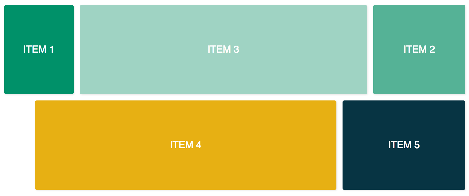
在這裡,我們將在 app.component.html 中新增程式碼,以將 Flex Layout 與 FlexLayoutModule 搭配使用。我們的最終結果將類似於下圖:
要達到上述結果,請在編輯器中開啟 app.component.css 並新增以下幾行程式碼:
|
1 2 3 4 5 6 7 8 9 10 11 12 13 14 15 16 17 18 19 20 21 22 23 24 25 26 27 28 29 30 31 32 |
.container { margin: 10px; } .item { border-radius: .2em; color: #ffffff; font-family: sans-serif; font-size: 2em; padding: 4em 1em; text-transform: uppercase; } .item-1 { background-color: #009169; } .item-2 { background-color: #55b296; } .item-3 { background-color: #9fd3c3; } .item-4 { background-color: #e7b013; } .item-5 { background-color: #073443; } |
新增上述程式碼後,請開啟 app.元件.html 檔案並新增以下程式碼。此程式碼包含兩個容器 div 以及五個內部 div:
|
1 2 3 4 5 6 7 8 9 10 11 12 13 14 15 16 17 18 19 20 21 22 23 24 25 |
<div class="container"> <div class="item item-1"> 項目 1 </div> <div class="item item-2"> 項目 2 </div> <div class="item item-3"> 項目 3 </div> </div> <div class="container"> <div class="item item-4"> 項目 4 </div> <div class="item item-5"> 項目 5 </div> </div> |
之後,編譯並執行您的應用程式。您將會看到五個 div 垂直堆疊在一起,因為到目前為止我們還沒有提供任何版面配置。若要新增 fxLayout 請新增以下程式碼:
|
1 2 3 4 5 6 7 8 9 10 11 12 13 14 15 16 17 18 19 20 21 22 23 24 25 26 |
<div class="container" fxLayout> <div class="item item-1"> 項目 1 </div> <div class="item item-2"> 項目 2 </div> <div class="item item-3"> 項目 3 </div> </div> <div class="container" fxLayout> <div class="item item-4"> 項目 4 </div> <div class="item item-5"> 項目 5 </div> </div> |
在上述程式碼中,套用此 fxLayout 後,CSS 屬性 display:flex 以及 flex-direction:row 樣式將會套用到容器 divs. 現在當您執行應用程式時,第一行將有三個 div,而底行將有兩個 div。
接下來,我們新增 fxLayoutAlign 以及 fxLayoutGap 來增強我們的版面配置:
|
1 2 3 4 5 6 7 8 9 10 11 12 13 14 15 16 17 18 19 20 21 22 23 24 |
<div class="container" fxLayout fxLayoutAlign="center" fxLayoutGap="10px"> <div class="item item-1"> 項目 1 </div> <div class="item item-2"> 項目 2 </div> <div class="item item-3"> 項目 3 </div> </div> <div class="container" fxLayout fxLayoutAlign="center" fxLayoutGap="10px"> <div class="item item-4"> 項目 4 </div> <div class="item item-5"> 項目 5 </div> </div> |
這將套用 place-content: stretch center 以及 align-items: stretch 樣式到容器 div。它還將套用 10px 的間距於 flex 項目之間。
現在我們已經套用了 fxLayout,是時候讓我們的版面配置具備響應式功能了:
|
1 2 3 4 5 6 7 8 9 10 11 12 13 14 15 16 17 18 19 20 21 22 23 24 |
<div class="container" fxLayout fxLayout.xs="column" fxLayoutAlign="center" fxLayoutGap="10px" fxLayoutGap.xs="0"> <div class="item item-1"> 項目 1 </div> <div class="item item-2"> 項目 2 </div> <div class="item item-3"> 項目 3 </div> </div> <div class="container" fxLayout fxLayout.xs="column" fxLayoutAlign="center" fxLayoutGap="10px" fxLayoutGap.xs="0"> <div class="item item-4"> 項目 4 </div> <div class="item item-5"> 項目 5 </div> </div> |
此程式碼將為極小 xs 螢幕設定中斷點。螢幕會將版面配置從預設的列(row)變更為欄(column),且間距大小在極小螢幕中將從 “10px” 減少至 “0px”。您可以透過執行應用程式並將視窗大小調整為 xs(寬度小於 599px)來進行測試。您將會觀察到樣式發生變化。
針對不同的螢幕尺寸,我們有不同的字尾:
-
sm – 小
-
md – 中
-
lg – 大
-
xl – 特大
我們也有針對子元素的指令。新增 fxFlex 如下方程式碼所示:
|
1 2 3 4 5 6 7 8 9 10 11 12 13 14 15 16 17 18 19 20 21 22 23 24 25 26 |
<div class="container" fxLayout fxLayoutAlign="center" fxLayoutGap="10px" fxLayoutGap.xs="0"> <div class="item item-1" fxFlex="15%"> 項目 1 </div> <div class="item item-2" fxFlex="20%"> 項目 2 </div> <div class="item item-3" fxFlex> 項目 3 </div> </div> <div class="container" fxLayout fxLayout.xs="column" fxLayoutAlign="center" fxLayoutGap="10px" fxLayoutGap.xs="0"> <div class="item item-4" fxFlex> 項目 4 </div> <div class="item item-5" fxFlex="200px"> 項目 5 </div> </div> |
這將會套用 flex-grow: 1, flex-shrink: 1,以及 flex-basis: 100% 至版面配置。如果您指定了寬度值,它將會套用 max-width 屬性。
讓我們新增 fxFlexOrder 和 fxFlexOffset:
|
1 2 3 4 5 6 7 8 9 10 11 12 13 14 15 16 17 18 19 20 21 22 23 24 25 |
<div class="container" fxLayout fxLayoutAlign="center" fxLayoutGap="10px" fxLayoutGap.xs="0"> <div class="item item-1" fxFlex="15%"> 項目 1 </div> <div class="item item-2" fxFlex="20%" fxFlexOrder="3"> 項目 2 </div> <div class="item item-3" fxFlex> 項目 3 </div> </div> <div class="container" fxLayout fxLayout.xs="column" fxLayoutAlign="center" fxLayoutGap="10px" fxLayoutGap.xs="0"> <div class="item item-4" fxFlex fxFlexOffset="30px" fxFlexOffset.xs="0"> 項目 4 </div> <div class="item item-5" fxFlex="200px"> 項目 5 </div> </div> |
使用此程式碼,我們套用了 order: 3 至第二個項目。它也會將 margin-left: 50px 套用至第四個項目。現在如果您執行應用程式,您將會看到第二個項目位於該列的第三個位置,而第四個項目則從起點獲得 30px 的間距。
總結
在本教學中,我們學習了如何在 Angular 應用程式中實作 Flex Layout。這將會非常有用,因為我們將能夠直接使用現成的 Flexbox CSS 版面配置,而無需自己編寫樣式程式碼。如果您需要更多資訊,請參閱 Flex Layout Wiki 於 GitHub 頁面。
為了在本教學中保持簡單,我們沒有使用繫結來將值繫結到元件類別中。然而,在元件類別中,單向和雙向繫結都是可行的 [fxLayout]="您的版面配置方向"。這將使您在建構版面配置時擁有更多控制權,並且可以處理動態的使用案例。
Angular 應用程式使用 Node.js 作為其執行環境。如果您想了解更多關於 Node.js 以及如何在 Docker 上部署 Node.js 應用程式,請查看我們的 如何在 Ubuntu 20.04 上使用 Docker 部署 Node.js (Express.js) 應用程式 教學。要了解更多關於 Angular 的資訊,請查看我們的教學 在 Angular Router 中使用 RouterLink、Navigate 和 NavigateByUrl 進行導覽.
祝您開發愉快!
留言
目前尚無留言。成為第一個留言的人吧。