
소개
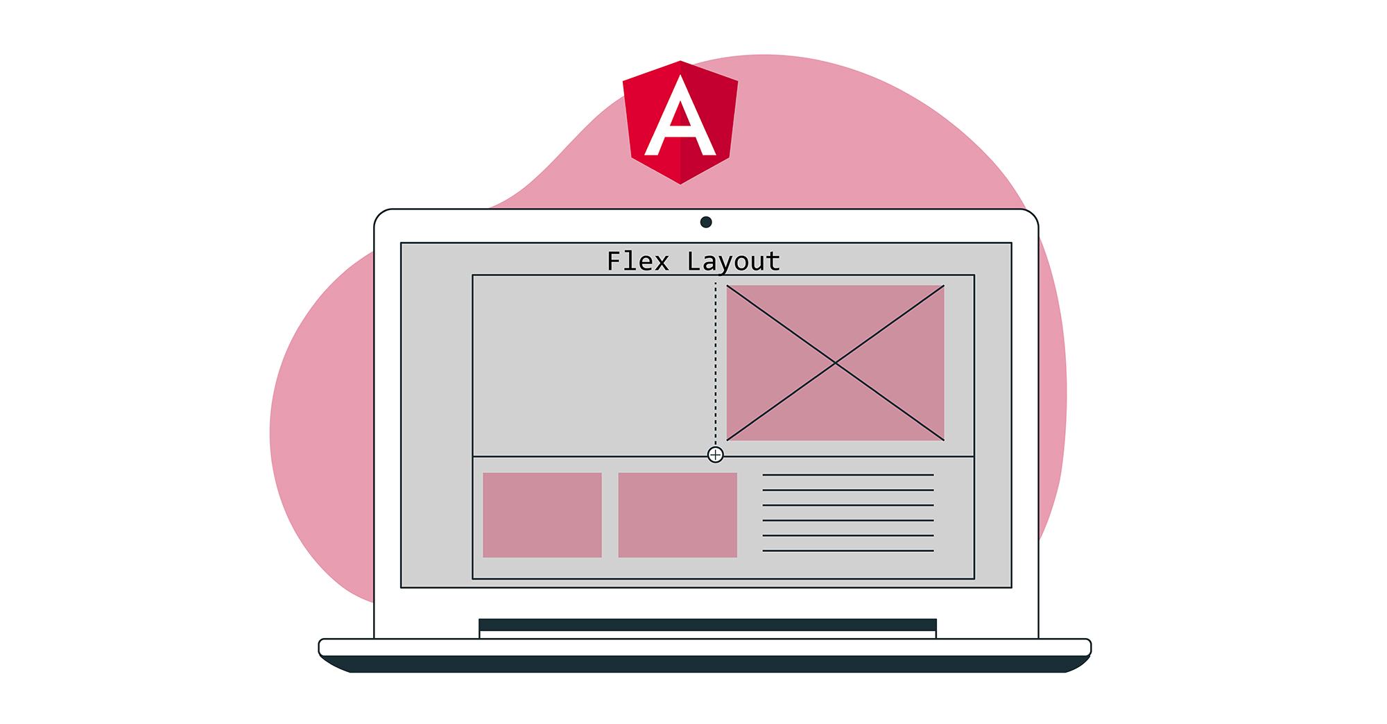
CSS Flex Layout은 유연하고 유동적인 레이아웃을 만드는 데 사용됩니다. 하지만 Angular를 사용할 때 레이아웃을 더 동적으로 제어해야 하는 시나리오가 있습니다. 또한, CSS Flexbox는 많은 개발자에게 어려울 수 있는 복잡한 스타일링을 필요로 합니다. Flex Layout은 이 문제를 해결하는 것을 목표로 하는 컴포넌트 엔진입니다. 애플리케이션에서 구현할 수 있는 일련의 디렉티브를 제공합니다.
Flex Layout은 Typescript을 사용하여 Angular 애플리케이션에 이상적입니다. 외부 스타일시트가 필요하지 않으며, 다양한 디렉티브를 사용하여 반응형 레이아웃을 만들 수 있습니다. 이 튜토리얼에서는 간단한 Angular 애플리케이션을 만들고 Flex Layout을 주입하여 컴포넌트를 배치해 보겠습니다.
시작해 봅시다!
사전 요구 사항
-
Angular 애플리케이션은 Node.js 런타임을 사용합니다. 이 튜토리얼을 완료하려면 개발 머신에 Node.js가 설치되어 있어야 합니다. Node.js를 쉽게 설정하는 데 도움이 되는 전체 가이드인 Ubuntu 18.04에 Node.js를 설치하는 방법이 준비되어 있습니다.
-
또한 다음에 대한 어느 정도의 친숙함이 필요합니다: Angular 컴포넌트 사용 및 Angular 프로젝트 설정.
프로젝트 구성
여기서는 두 가지 단계를 수행해야 합니다:
- 새로운 Angular 애플리케이션을 설정해야 합니다.
- 우리는 npx로부터 Flex Layout을 설치하여 애플리케이션에서 가져와 사용할 수 있도록 해야 합니다.
새로운 Angular 애플리케이션을 만들려면 터미널을 열고 아래 명령어를 실행하세요:
|
1 |
npx @angular/cli new angular-flex-example --style=css --routing=false --skip-tests |
여기서는 @angular/cli를 사용하여 새로운 Angular 애플리케이션을 생성하고 있습니다. 애플리케이션 이름은 angular-flex-example입니다. 스타일링으로는 Sass나 Less 대신 CSS를 사용합니다. 또한 라우팅이 필요하지 않음을 지정합니다. 테스트도 신경 쓰지 않으므로 건너뜁니다.
이제 애플리케이션이 준비되었으므로, 애플리케이션 디렉터리로 이동하여 아래 명령어를 실행해 Flex Layout을 설치합니다:
|
1 2 |
cd angular-flex-example npm install @angular/flex-layout@10.0.0-beta.32 |
위 명령어의 설치가 완료되면, FlexLayoutModule:
|
1 2 3 4 5 6 7 8 9 10 11 12 13 14 15 16 17 18 19 20 21 |
import { BrowserModule } from '@angular/platform-browser'; import { NgModule } from '@angular/core'; import { FlexLayoutModule } from "@angular/flex-layout"; import { AppComponent } from './app.component'; @NgModule({ declarations: [ AppComponent ], imports: [ BrowserModule, FlexLayoutModule ], providers: [], bootstrap: [AppComponent] }) export class AppModule { } |
다음으로, 모든 것이 예상대로 실행되는지 확인하기 위해 아래 명령어를 실행합니다:
|
1 |
npm start |
애플리케이션은 기본적으로 localhost:4200에서 제공됩니다. 웹 브라우저에서 이 URL로 이동하세요. 다음과 같은 메시지가 표시됩니다: “angular-flex-example is running!. 이 설정이 완료되었으므로, Flex Layout을 사용하여 템플릿을 디자인해 보겠습니다.
Flex Layout 만들기
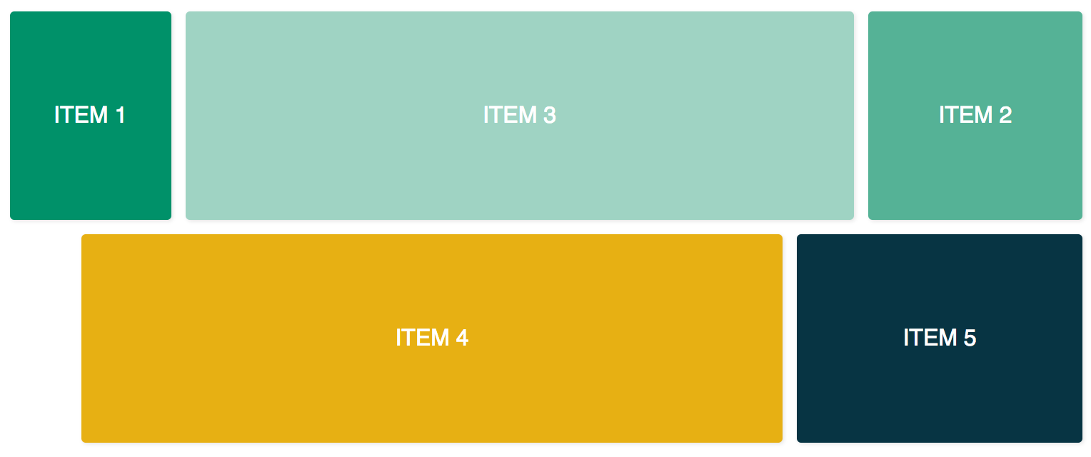
여기서는 app.component.html에 코드를 추가하여 FlexLayoutModule과 함께 Flex Layout을 사용합니다. 최종 결과는 아래 그림과 유사할 것입니다:
위의 결과를 얻으려면 에디터에서 app.component.css 파일을 열고 아래 코드 줄을 추가하세요:
|
1 2 3 4 5 6 7 8 9 10 11 12 13 14 15 16 17 18 19 20 21 22 23 24 25 26 27 28 29 30 31 32 |
.container { margin: 10px; } .item { border-radius: .2em; color: #ffffff; font-family: sans-serif; font-size: 2em; padding: 4em 1em; text-transform: uppercase; } .item-1 { background-color: #009169; } .item-2 { background-color: #55b296; } .item-3 { background-color: #9fd3c3; } .item-4 { background-color: #e7b013; } .item-5 { background-color: #073443; } |
이제 위의 코드를 추가했으므로, app.component.html 파일을 열고 다음 코드를 추가합니다. 이 코드에는 두 개의 컨테이너 div와 다섯 개의 내부 div가 포함되어 있습니다.:
|
1 2 3 4 5 6 7 8 9 10 11 12 13 14 15 16 17 18 19 20 21 22 23 24 25 |
<div class="container"> <div class="item item-1"> Item 1 </div> <div class="item item-2"> Item 2 </div> <div class="item item-3"> Item 3 </div> </div> <div class="container"> <div class="item item-4"> Item 4 </div> <div class="item item-5"> Item 5 </div> </div> |
그 후, 애플리케이션을 컴파일하고 실행합니다. 다섯 개의 div가 서로 위에 쌓여 있는 것을 볼 수 있는데, 이는 지금까지 레이아웃을 제공하지 않았기 때문입니다. fxLayout을 추가하려면 아래 코드를 추가하십시오:
|
1 2 3 4 5 6 7 8 9 10 11 12 13 14 15 16 17 18 19 20 21 22 23 24 25 26 |
<div class="container" fxLayout> <div class="item item-1"> Item 1 </div> <div class="item item-2"> Item 2 </div> <div class="item item-3"> Item 3 </div> </div> <div class="container" fxLayout> <div class="item item-4"> Item 4 </div> <div class="item item-5"> Item 5 </div> </div> |
위의 코드에서, 이 fxLayout을 적용한 후, CSS 속성인 display:flex 및 flex-direction:row 스타일이 컨테이너 div에 적용됩니다.s. 이제 애플리케이션을 실행하면 첫 번째 행에 3개의 div가 있고 아래쪽 행에 2개의 div가 있게 됩니다.
다음으로, 다음을 추가합니다. fxLayoutAlign 및 fxLayoutGap 을 추가하여 레이아웃을 개선합니다:
|
1 2 3 4 5 6 7 8 9 10 11 12 13 14 15 16 17 18 19 20 21 22 23 24 |
<div class="container" fxLayout fxLayoutAlign="center" fxLayoutGap="10px"> <div class="item item-1"> 아이템 1 </div> <div class="item item-2"> 아이템 2 </div> <div class="item item-3"> 아이템 3 </div> </div> <div class="container" fxLayout fxLayoutAlign="center" fxLayoutGap="10px"> <div class="item item-4"> 아이템 4 </div> <div class="item item-5"> 아이템 5 </div> </div> |
이렇게 하면 다음이 적용됩니다. place-content: stretch center 및 align-items: stretch 스타일이 컨테이너 div에 적용됩니다. 또한 flex 아이템 사이에 10px의 여백이 적용됩니다.
이제 fxLayout을 적용했으므로, 레이아웃을 반응형으로 만들 차례입니다:
|
1 2 3 4 5 6 7 8 9 10 11 12 13 14 15 16 17 18 19 20 21 22 23 24 |
<div class="container" fxLayout fxLayout.xs="column" fxLayoutAlign="center" fxLayoutGap="10px" fxLayoutGap.xs="0"> <div class="item item-1"> 아이템 1 </div> <div class="item item-2"> 아이템 2 </div> <div class="item item-3"> 아이템 3 </div> </div> <div class="container" fxLayout fxLayout.xs="column" fxLayoutAlign="center" fxLayoutGap="10px" fxLayoutGap.xs="0"> <div class="item item-4"> 아이템 4 </div> <div class="item item-5"> 아이템 5 </div> </div> |
이 코드는 매우 작은 xs 화면에 대한 중단점을 설정합니다. 화면은 레이아웃을 기본 row에서 column으로 변경하고, 매우 작은 화면에서는 간격 크기가 “10px”에서 “0px”로 줄어듭니다. 애플리케이션을 실행하고 창 크기를 xs (너비 599px 미만)로 조절하여 이를 테스트할 수 있습니다. 스타일이 변경되는 것을 확인할 수 있습니다.
다양한 화면 크기에 따라 다음과 같은 접미사가 있습니다:
-
sm – 소형
-
md – 중형
-
lg – 대형
-
xl – 초대형
자식 요소를 위한 디렉티브도 있습니다. 아래 코드와 같이 fxFlex를 추가합니다:
|
1 2 3 4 5 6 7 8 9 10 11 12 13 14 15 16 17 18 19 20 21 22 23 24 25 26 |
<div class="container" fxLayout fxLayoutAlign="center" fxLayoutGap="10px" fxLayoutGap.xs="0"> <div class="item item-1" fxFlex="15%"> 아이템 1 </div> <div class="item item-2" fxFlex="20%"> 아이템 2 </div> <div class="item item-3" fxFlex> 아이템 3 </div> </div> <div class="container" fxLayout fxLayout.xs="column" fxLayoutAlign="center" fxLayoutGap="10px" fxLayoutGap.xs="0"> <div class="item item-4" fxFlex> 아이템 4 </div> <div class="item item-5" fxFlex="200px"> 아이템 5 </div> </div> |
이것은 flex-grow: 1, flex-shrink: 1, 그리고 flex-basis: 100%를 레이아웃에 적용합니다. 너비 값을 지정하면 max-width 속성이 적용됩니다.
다음의 fxFlexOrder 및 fxFlexOffset을 추가해 보겠습니다.:
|
1 2 3 4 5 6 7 8 9 10 11 12 13 14 15 16 17 18 19 20 21 22 23 24 25 |
<div class="container" fxLayout fxLayoutAlign="center" fxLayoutGap="10px" fxLayoutGap.xs="0"> <div class="item item-1" fxFlex="15%"> 아이템 1 </div> <div class="item item-2" fxFlex="20%" fxFlexOrder="3"> 아이템 2 </div> <div class="item item-3" fxFlex> 아이템 3 </div> </div> <div class="container" fxLayout fxLayout.xs="column" fxLayoutAlign="center" fxLayoutGap="10px" fxLayoutGap.xs="0"> <div class="item item-4" fxFlex fxFlexOffset="30px" fxFlexOffset.xs="0"> 아이템 4 </div> <div class="item item-5" fxFlex="200px"> 아이템 5 </div> </div> |
이 코드를 사용하여 두 번째 아이템에 order: 3를 적용했습니다. 또한 네 번째 아이템에 margin-left: 50px를 적용합니다. 이제 애플리케이션을 실행하면 두 번째 아이템은 행의 세 번째 위치에 배치되고, 네 번째 아이템은 시작 부분에서 30px의 간격을 두게 됩니다.
마무리
이 튜토리얼에서는 Angular 앱에서 Flex Layout을 구현하는 방법을 배웠습니다. 이는 스타일을 직접 코딩할 필요 없이 바로 사용할 수 있는 Flexbox CSS 레이아웃을 사용할 수 있게 해주므로 유용할 것입니다. 더 많은 정보가 필요하시면, GitHub 페이지에 있는 Flex Layout 위키를 참조하세요.
이 튜토리얼에서는 단순함을 유지하기 위해 컴포넌트 클래스에서 값을 바인딩하는 데 바인딩을 사용하지 않았습니다. 하지만 컴포넌트 클래스에서 단방향 및 양방향 바인딩이 모두 가능합니다. [fxLayout]="your layout direction". 이를 통해 레이아웃을 구축하는 데 더 많은 제어권을 가질 수 있으며 동적인 사용 사례를 처리할 수 있습니다.
Angular 앱은 Node.js를 런타임으로 사용합니다. Node.js와 Docker에 Node.js 애플리케이션을 배포하는 방법에 대해 자세히 알아보려면, 저희의 Ubuntu 20.04에서 Docker로 Node.js (Express.js) 앱을 배포하는 방법 튜토리얼을 확인해 보세요. Angular에 대해 자세히 알아보려면, 저희의 튜토리얼인 Angular Router에서 RouterLink, Navigate 및 NavigateByUrl을 사용한 탐색.
즐거운 컴퓨팅 되세요!
댓글
아직 댓글이 없습니다. 첫 번째로 작성해 보세요.