
Introduction
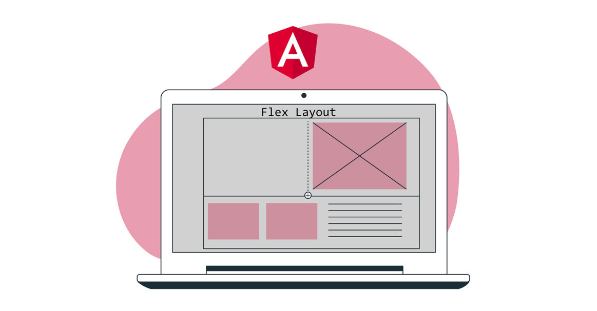
CSS Flex Layout is used to create flexible fluid layouts. However, when using Angular there are scenarios when we need more dynamic control over the layouts. Further, using CSS Flexbox requires complicated styling which can be hard for many developers. Flex Layout is a component engine that aims to solve this problem. It provides a set of directives that are available for implementation in your applications.
The Flex Layout uses Typescript making it ideal for Angular applications. No external stylesheets are needed, and different directives can be used to create responsive layouts. In this tutorial, we will create a simple Angular application and inject Flex Layout to arrange our components.
Let’s start!
Prerequisites
-
Angular applications use Node.js runtime. To complete this tutorial, you will need to have Node.js installed on your development machine. We have a complete guide How To Install Node.js On Ubuntu 18.04 that will help you set up Node.js easily.
-
You will also need to have some familiarity with using Angular components and setting up an Angular project.
Project Configuration
Here we need to perform two steps:
- We need to set up a new Angular application.
- We will need to install Flex Layout from npx so that we can import and use it in our application.
To create a new Angular application, open your terminal and run the below command:
|
1 |
npx @angular/cli new angular-flex-example --style=css --routing=false --skip-tests |
Here we are creating a new Angular application using @angular/cli. Our application name is angular-flex-example. We will be using CSS rather than Sass or Less as styling. In addition, we will specify that we do not need routing. We are also not concerned with the tests, so we skip them as well.
Now that your application is ready, navigate to the application directory and run the below command to install Flex Layout:
|
1 2 |
cd angular-flex-example npm install @angular/flex-layout@10.0.0-beta.32 |
Once the above command finishes the installation, add the below code in your app module to import FlexLayoutModule:
|
1 2 3 4 5 6 7 8 9 10 11 12 13 14 15 16 17 18 19 20 21 |
import { BrowserModule } from '@angular/platform-browser'; import { NgModule } from '@angular/core'; import { FlexLayoutModule } from "@angular/flex-layout"; import { AppComponent } from './app.component'; @NgModule({ declarations: [ AppComponent ], imports: [ BrowserModule, FlexLayoutModule ], providers: [], bootstrap: [AppComponent] }) export class AppModule { } |
Next, run the below command to ensure that everything is running as expected:
|
1 |
npm start |
Your application will be served on localhost:4200 by default. Navigate to this URL in the web browser. You will see the message: “angular-flex-example is running!. Having this setup complete, let’s design our template using Flex Layout.
Create the Flex Layout
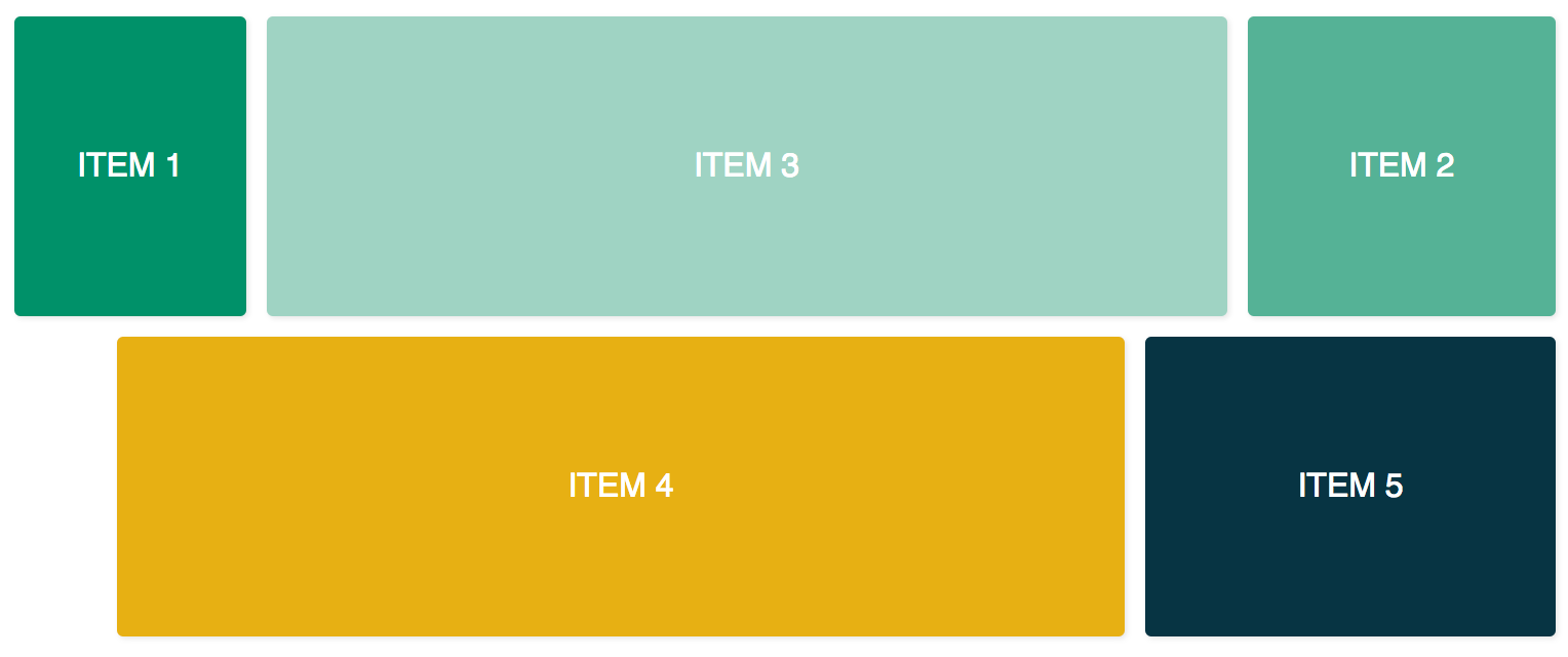
Here we will be adding code in app.component.html to use the Flex Layout with FlexLayoutModule. Our final result would be similar to the figure below:
To achieve the above result, open the app.component.css in your editor and add the below lines of code:
|
1 2 3 4 5 6 7 8 9 10 11 12 13 14 15 16 17 18 19 20 21 22 23 24 25 26 27 28 29 30 31 32 |
.container { margin: 10px; } .item { border-radius: .2em; color: #ffffff; font-family: sans-serif; font-size: 2em; padding: 4em 1em; text-transform: uppercase; } .item-1 { background-color: #009169; } .item-2 { background-color: #55b296; } .item-3 { background-color: #9fd3c3; } .item-4 { background-color: #e7b013; } .item-5 { background-color: #073443; } |
Now that you have added the above code, open the app.component.html file and add the following code. This code has two container divs and five inner divs:
|
1 2 3 4 5 6 7 8 9 10 11 12 13 14 15 16 17 18 19 20 21 22 23 24 25 |
<div class="container"> <div class="item item-1"> Item 1 </div> <div class="item item-2"> Item 2 </div> <div class="item item-3"> Item 3 </div> </div> <div class="container"> <div class="item item-4"> Item 4 </div> <div class="item item-5"> Item 5 </div> </div> |
After that, compile and run your application. You will see five divs stacked on top of each other because we have not provided any layout until now. To add the fxLayout add the below code:
|
1 2 3 4 5 6 7 8 9 10 11 12 13 14 15 16 17 18 19 20 21 22 23 24 25 26 |
<div class="container" fxLayout> <div class="item item-1"> Item 1 </div> <div class="item item-2"> Item 2 </div> <div class="item item-3"> Item 3 </div> </div> <div class="container" fxLayout> <div class="item item-4"> Item 4 </div> <div class="item item-5"> Item 5 </div> </div> |
In the above code, after applying this fxLayout, CSS properties display:flex and flex-direction:row styles are applied to the container divs. Now when you run the application, you will have three divs on the first row and two divs on the bottom row.
Next, we add fxLayoutAlign and fxLayoutGap to enhance our layout:
|
1 2 3 4 5 6 7 8 9 10 11 12 13 14 15 16 17 18 19 20 21 22 23 24 |
<div class="container" fxLayout fxLayoutAlign="center" fxLayoutGap="10px"> <div class="item item-1"> Item 1 </div> <div class="item item-2"> Item 2 </div> <div class="item item-3"> Item 3 </div> </div> <div class="container" fxLayout fxLayoutAlign="center" fxLayoutGap="10px"> <div class="item item-4"> Item 4 </div> <div class="item item-5"> Item 5 </div> </div> |
This will apply place-content: stretch center and align-items: stretch styles to the container div. It will also apply 10px of space between the flex items.
Now that we have applied fxLayout, it’s time to make our layout responsive:
|
1 2 3 4 5 6 7 8 9 10 11 12 13 14 15 16 17 18 19 20 21 22 23 24 |
<div class="container" fxLayout fxLayout.xs="column" fxLayoutAlign="center" fxLayoutGap="10px" fxLayoutGap.xs="0"> <div class="item item-1"> Item 1 </div> <div class="item item-2"> Item 2 </div> <div class="item item-3"> Item 3 </div> </div> <div class="container" fxLayout fxLayout.xs="column" fxLayoutAlign="center" fxLayoutGap="10px" fxLayoutGap.xs="0"> <div class="item item-4"> Item 4 </div> <div class="item item-5"> Item 5 </div> </div> |
This code will set the breakpoint for the extra small xs screens. The screen will change the layout from default row to column and the gap size will reduce from “10px” to “0px” in the extra small screens. You can test this by running the application and resizing the window to xs (less than 599px wide). You will observe the styling being changed.
For various screen sizes we have different suffices:
-
sm – small
-
md – medium
-
lg – large
-
xl – extra-large
We also have directives for child elements. Add fxFlex as in the below code:
|
1 2 3 4 5 6 7 8 9 10 11 12 13 14 15 16 17 18 19 20 21 22 23 24 25 26 |
<div class="container" fxLayout fxLayoutAlign="center" fxLayoutGap="10px" fxLayoutGap.xs="0"> <div class="item item-1" fxFlex="15%"> Item 1 </div> <div class="item item-2" fxFlex="20%"> Item 2 </div> <div class="item item-3" fxFlex> Item 3 </div> </div> <div class="container" fxLayout fxLayout.xs="column" fxLayoutAlign="center" fxLayoutGap="10px" fxLayoutGap.xs="0"> <div class="item item-4" fxFlex> Item 4 </div> <div class="item item-5" fxFlex="200px"> Item 5 </div> </div> |
This will apply flex-grow: 1, flex-shrink: 1, and flex-basis: 100% to the layout. If you specify the width value, it will apply the max-width property.
Let’s add fxFlexOrder and fxFlexOffset:
|
1 2 3 4 5 6 7 8 9 10 11 12 13 14 15 16 17 18 19 20 21 22 23 24 25 |
<div class="container" fxLayout fxLayoutAlign="center" fxLayoutGap="10px" fxLayoutGap.xs="0"> <div class="item item-1" fxFlex="15%"> Item 1 </div> <div class="item item-2" fxFlex="20%" fxFlexOrder="3"> Item 2 </div> <div class="item item-3" fxFlex> Item 3 </div> </div> <div class="container" fxLayout fxLayout.xs="column" fxLayoutAlign="center" fxLayoutGap="10px" fxLayoutGap.xs="0"> <div class="item item-4" fxFlex fxFlexOffset="30px" fxFlexOffset.xs="0"> Item 4 </div> <div class="item item-5" fxFlex="200px"> Item 5 </div> </div> |
Using this code we applied order: 3 to the second item. It will also make the margin-left: 50px to the fourth item. Now if you run the application, you will see that the second item is in the third position of the row while the fourth item gets 30px spacing from the start.
Wrapping It Up
In this tutorial, we learned how to implement the Flex Layout in Angular apps. This is going to be helpful as we will be able to use ready-to-use Flexbox CSS layouts without having to code the styling ourselves. If you need more information, refer to the Flex Layout Wiki on the GitHub page.
To keep things simple in this tutorial, we did not use binding to bind values in the component class. However, both unidirectional and bidirectional binding is possible in component class [fxLayout]="your layout direction". This will give you more control to build layouts and dynamic use cases can be handled.
Angular apps use Node.js as their runtime. If you want to learn more about Node.js and how to deploy Node.js applications on Docker, check out our How to Deploy a Node.js (Express.js) App with Docker on Ubuntu 20.04 tutorial. To learn more about Angular, check out our tutorial Navigation with RouterLink, Navigate, and NavigateByUrl in Angular Router.
Happy Computing!
- How To Enable, Create and Use the .htaccess File: A Tutorial - March 8, 2023
- An Overview of Queries in MySQL - October 28, 2022
- Introduction to Cookies: Understanding and Working with JavaScript Cookies - October 25, 2022
- An Overview of Data Types in Ruby - October 24, 2022
- The Architecture of Iptables and Netfilter - October 10, 2022